Typsetting in DND Books
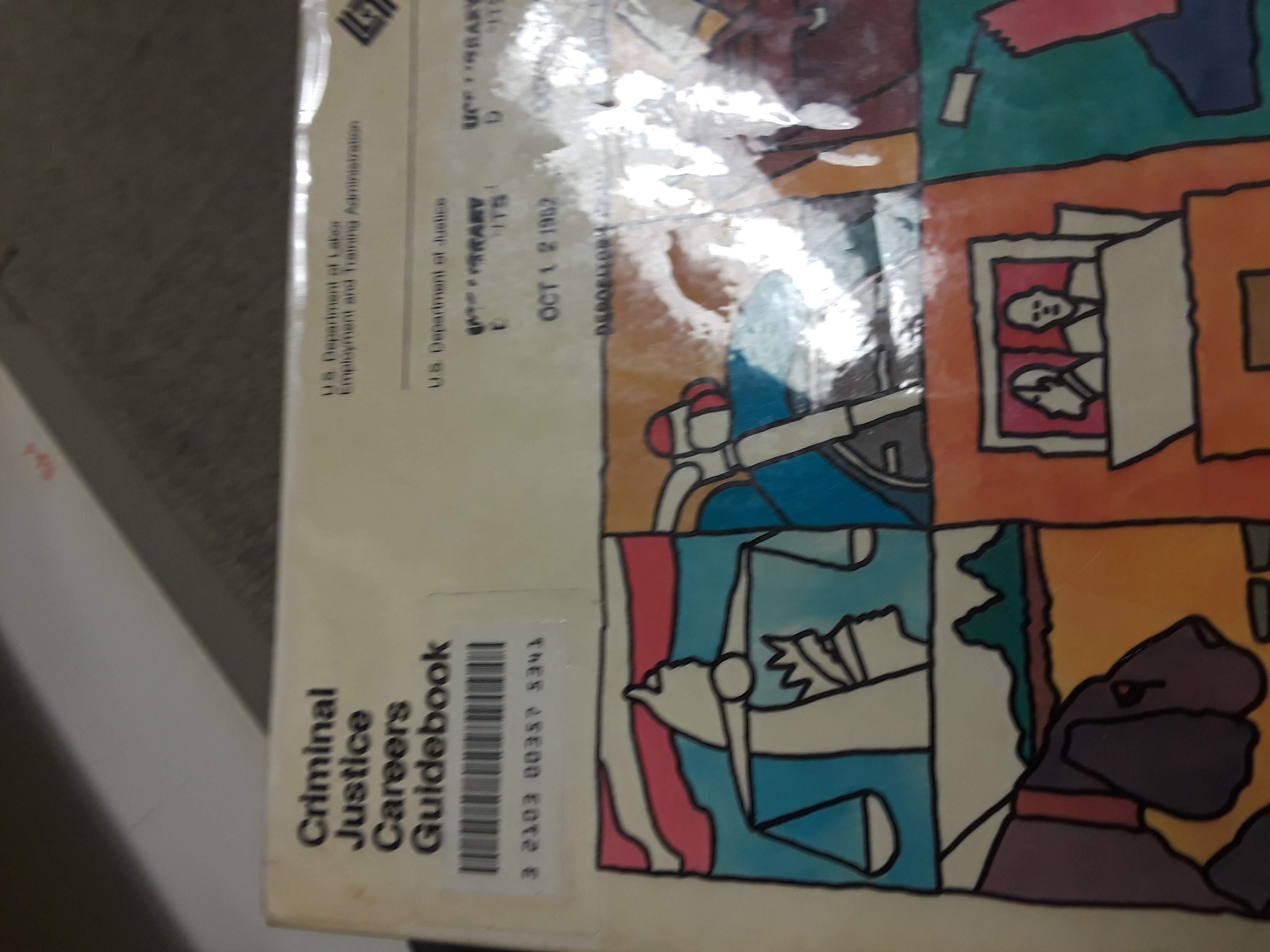
Killing some time in the library earlier by looking through random books in the bottom floor and found this old career guide.

What struck me was how odd it would be to live in an era before the internet was everywhere and you had to find out what jobs you could get by having the government print a book and send it to a library nearby. What also struck me was how much the inside looked like a job-focused Dungeons and Dragons book.

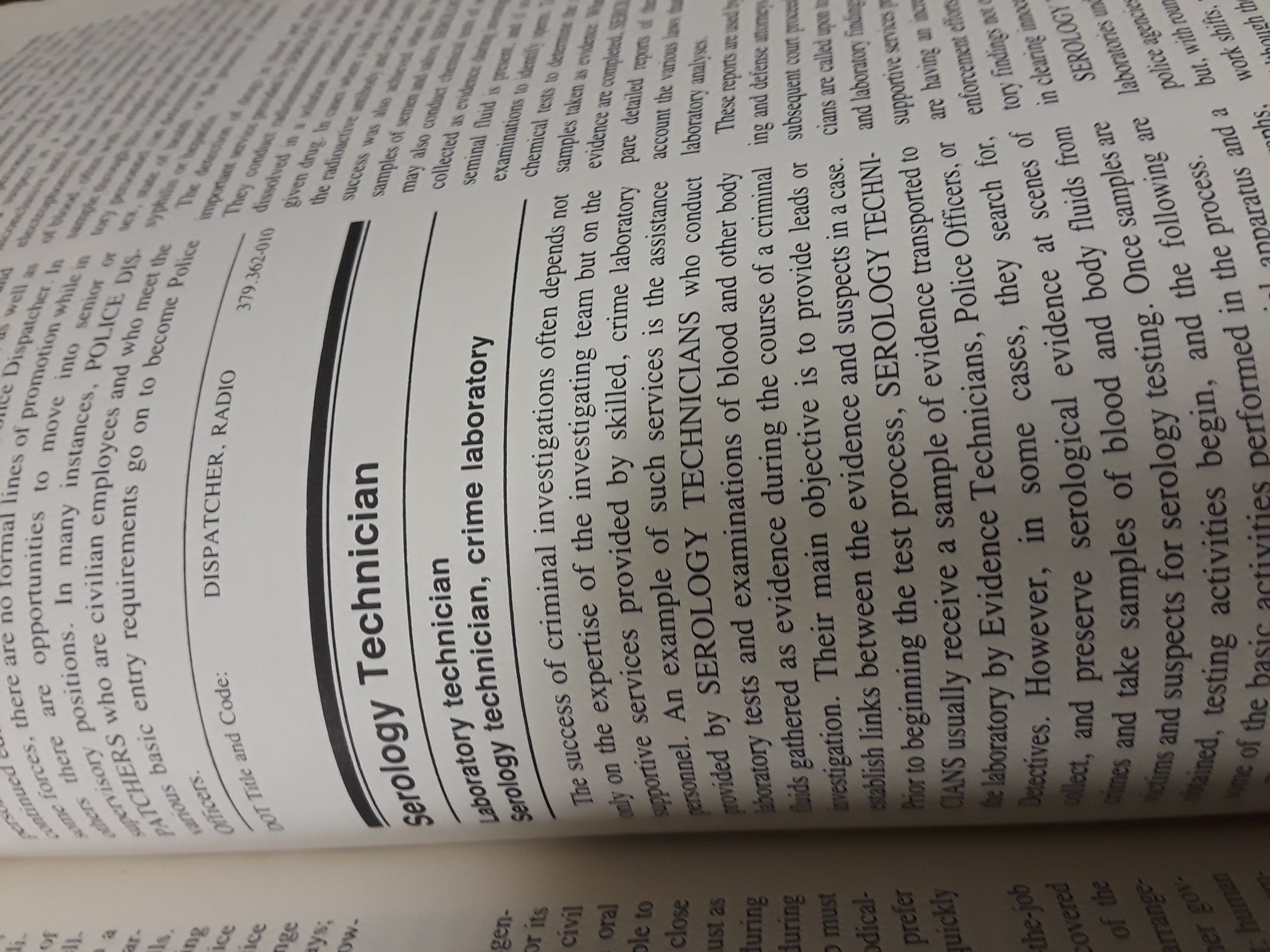
It has such a particular style. With the heavy double horizontal rules to delineate sections, use of ALL CAPS for job titles, and double column layout. I love how the old school DnD books look because I always want to capture that nostalgia, and something about this seemed very familiar.

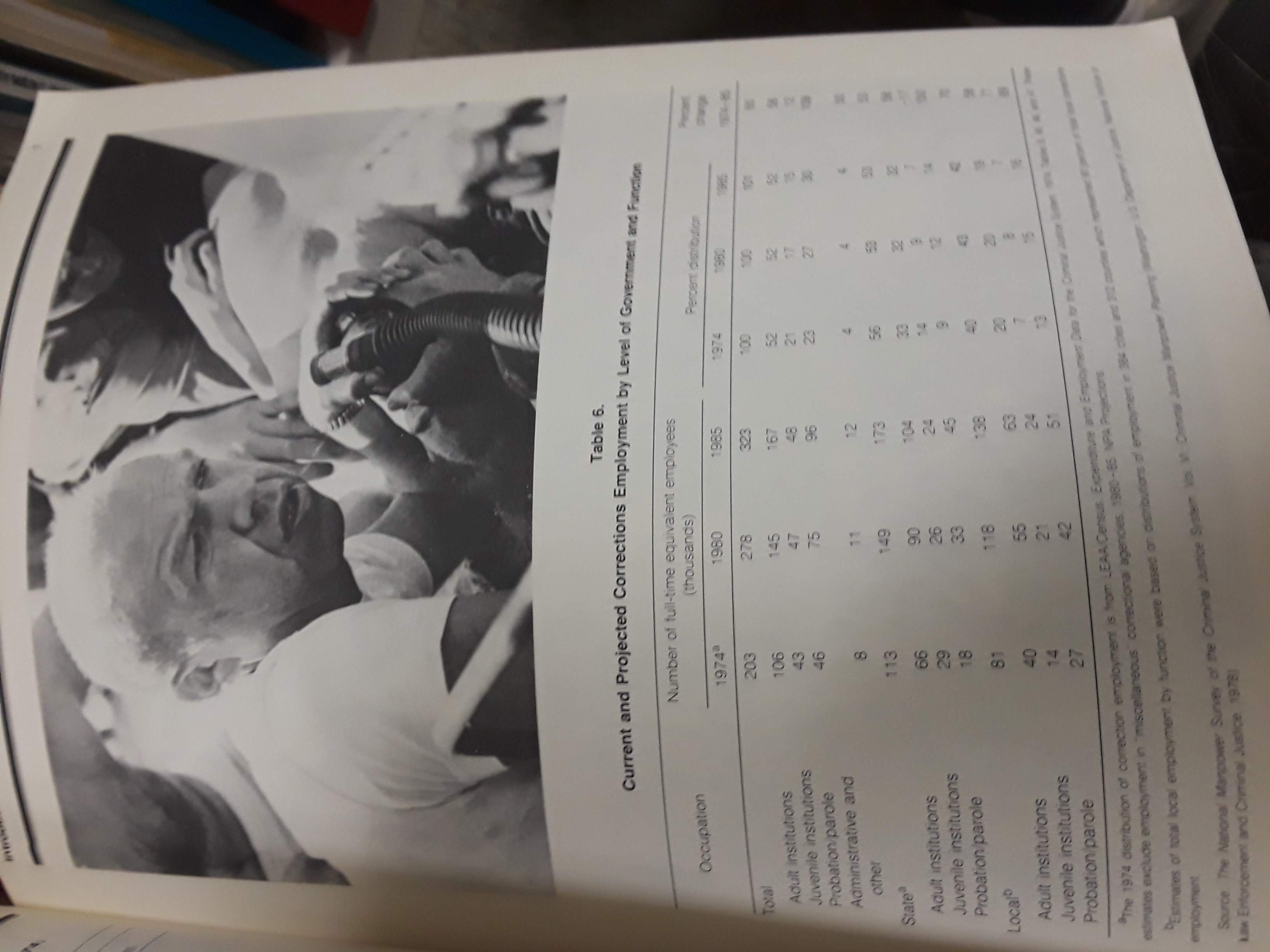
From the different font used in the table. Even to how the table makes use of horizontal lines, wide spacing, and an overabundance of footnotes. To the strange hand-drawn images strewn in.

I wonder though, is it that this career guide looks like a DnD book, or is it the other way around? Were the creators of early DnD manuals simply influenced by the types of material they were picking up in the library? Was this a trend at the time? Or totally unrelated?
I consulted a librarian and the library’s graphic designer to see if they had any insights, or books on the “history of typography and graphic design of reference manuals and gaming books of the late 20th century”, but to no avail.